SiliconValley4u
SiliconValley4u is a company focused on teaching code to kids K-12 . I was referred to them to help redesign and develop their website.
Role:
Product Designer & Developer
Tools:
Figma, Webflow
Client:
SiliconValley4u
Date:
Jan 2022 - Mar 2022
01
The Problem
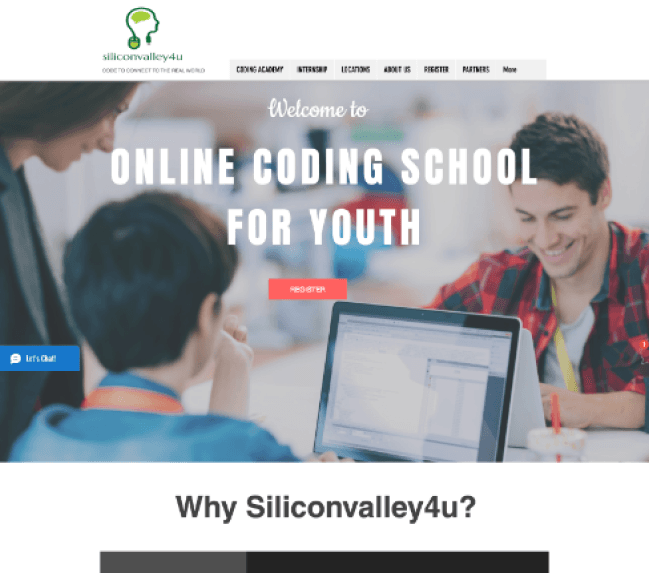
SiliconValley4U's current website is cluttered, leading to high bounce rates and low engagement. Clear calls to action are lacking, hindering conversion rates and lead generation.
02
The Solution
A website redesign will simplify navigation, prioritize mobile responsiveness, and incorporate clear calls to action. By leveraging user feedback and industry best practices, SiliconValley4U can create a modern, intuitive website that drives engagement and conversions.
03
Market Research
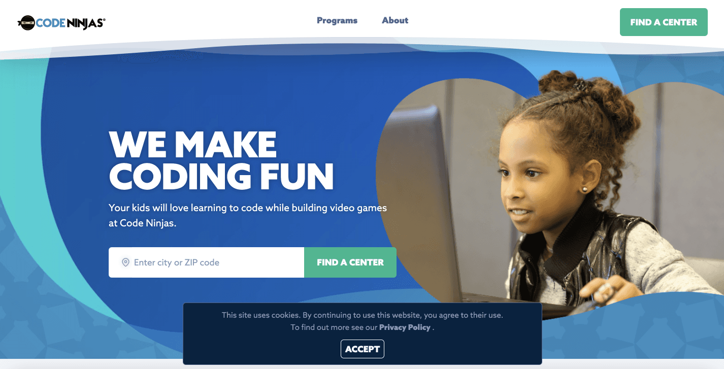
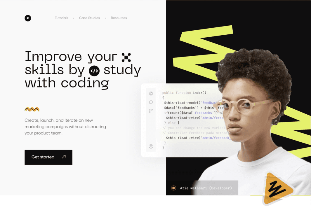
I analyzed competitor website models to identify trends and assess areas for improvement. Then, I studied the existing SiliconValley4U website to determine its competitive advantage online.
✓ Really strong SEO system
✓ Strong marketing and brand identity
✗ Website is lacking social proof or testimonials
✓ Easy to use, clear call to action.
✓ A great SEO ranking for more website traffic
✓ Consistent color brand guidelines
04
Takeaways from Market Research
Despite its successful business model, SiliconValley4U faces strong competition.
Key features like call-to-action buttons and navigation bars are missing on SiliconValley4U's site, unlike competitors.
SiliconValley4U has post-course offerings such as internships, unlike most competitors.
Most competitors have organized course structure unlike SiliconValley4u
05
Stake Holder Interviews
I spoke with the founder and operating manager of SiliconValley4u to establish key points for the redesigned website. These include:
Implementing a simple call-to-action to streamline the user journey and enhance focus.
Developing a course roadmap that clearly communicates how each course is interconnected.
Creating an easily navigable marketplace for users to browse and purchase courses.
06
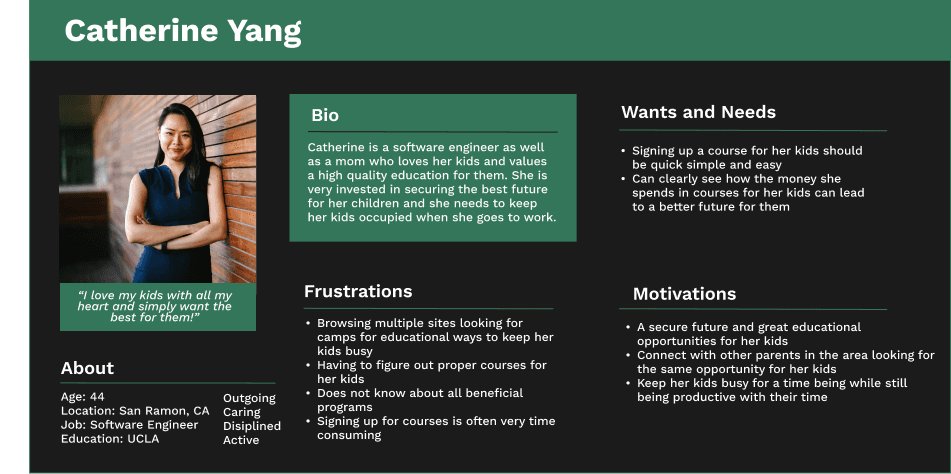
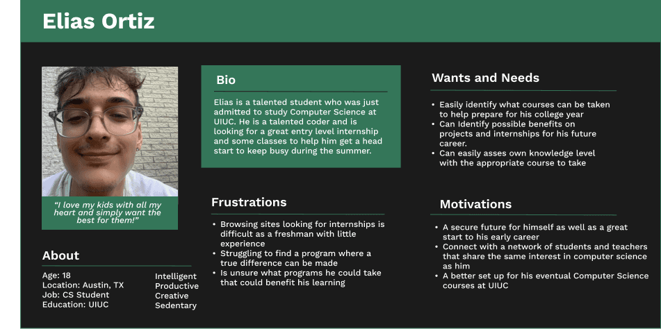
User Personas
When designing, I always keep the target market in mind. To create the initial wireframe, I developed two user personas for the website and consistently referred to their wants, needs, frustrations, and motivations throughout the design process.
07
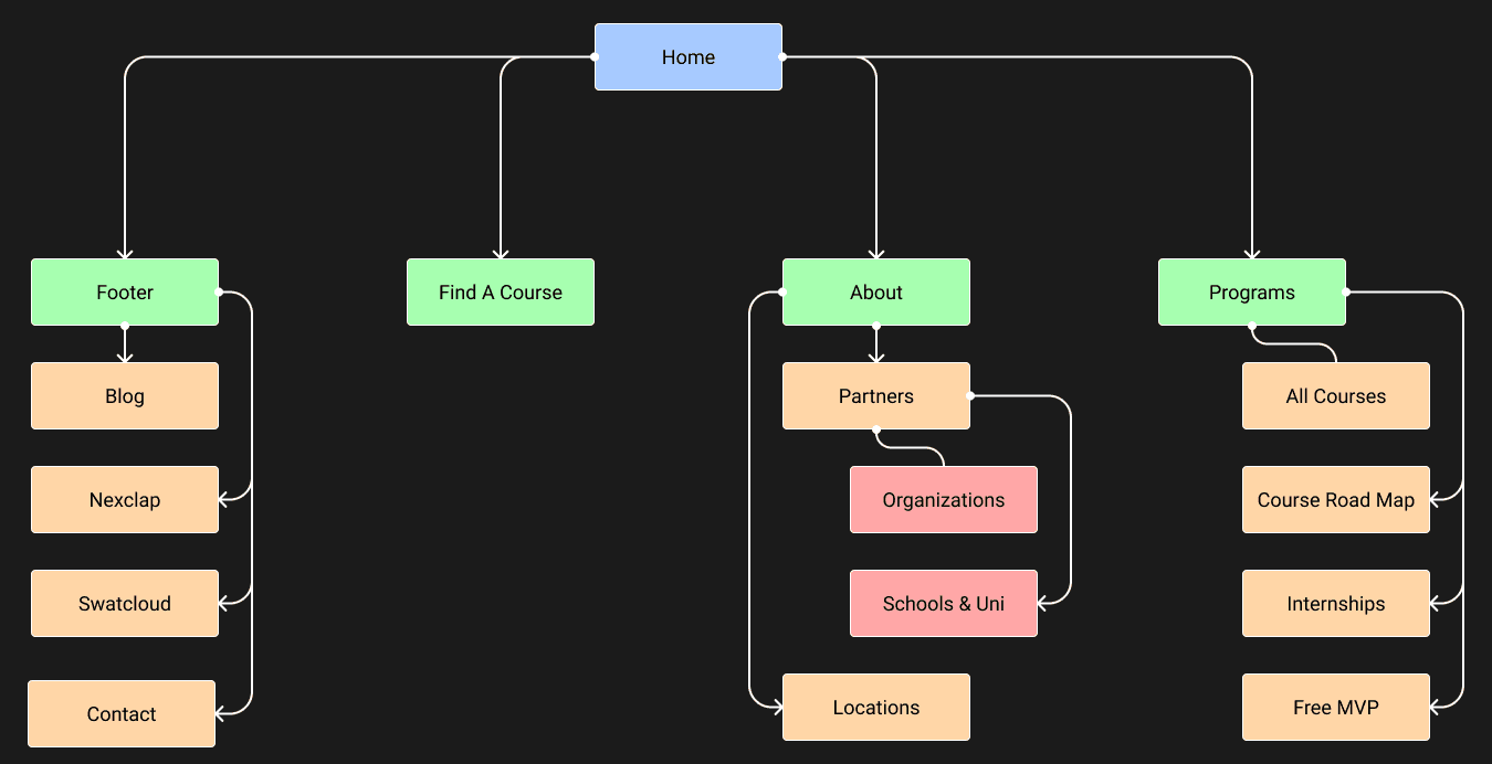
Site Map
Before diving into website design, I utilized insights from the original site, stakeholder interviews, and market research to craft a sitemap. This ensured that all website features were accessible without compromising user experience with confusion or complexity.
08
Lo-Fi
Before diving into main design elements, efficient website architecture must be established in low detail for easy redesign. I crafted a low-fidelity design to plan an intuitive structure with optimal call-to-action placement.
09
Hi-Fi
After finalizing the low-fidelity design and ensuring it meets both the client's and users' needs, the style guides and typography are integrated into the final design. This design will be directly translated into Webflow later on.
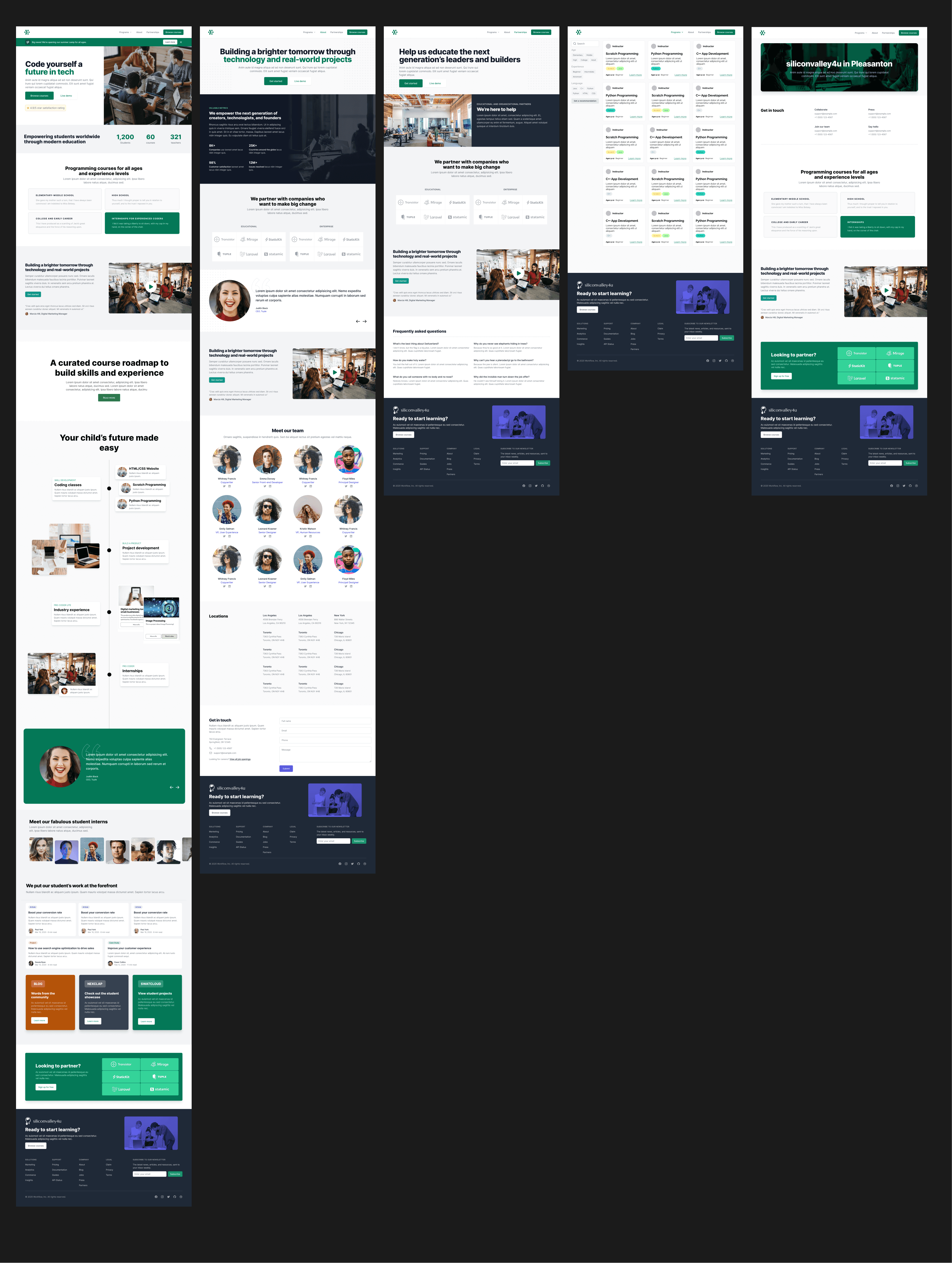
10
Development in Webflow
I used Webflow to build the website, referring back to the hi-fidelity mockup made in Figma.
11
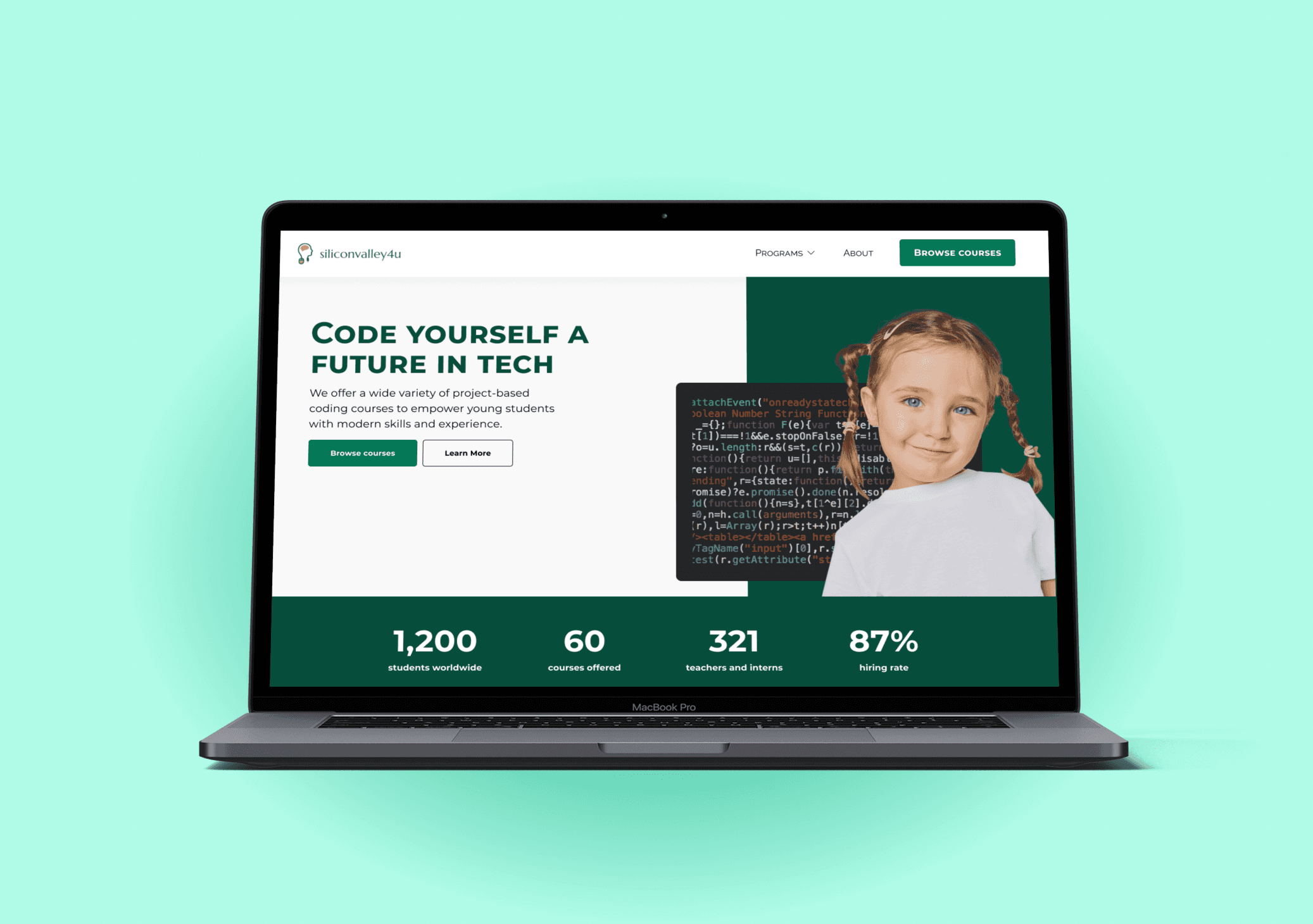
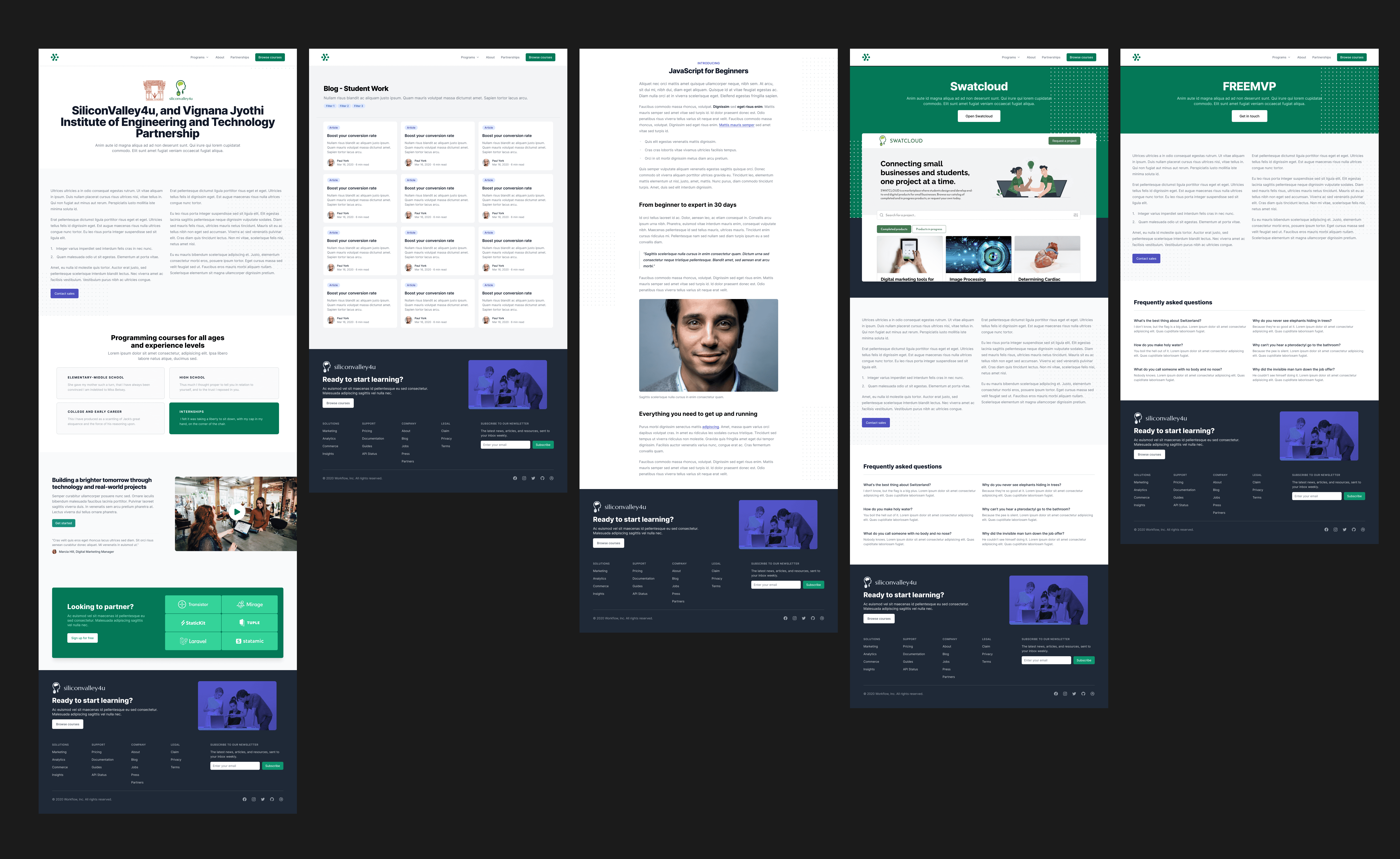
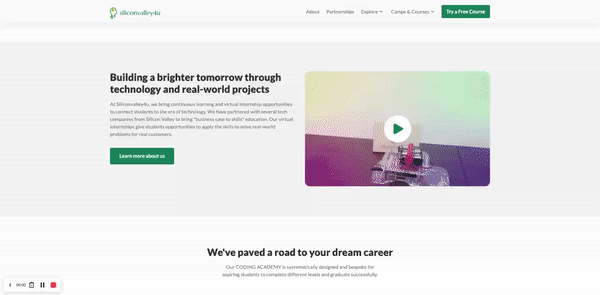
Key solution #1 - Effective Hero Section & Home Page
The first improvement I made to the site was creating a captivating and clear hero section. This is crucial as it forms the initial impression for visitors, helping engage them and decrease the abandonment rate. Key aspects included:
Personable and visually appealing hero image
Clear call-to-action with a descriptive text
Social proof at the bottom to instill trust
Simplified navigation bar to reduce website complexity.

12
Key Solution #2 - Interactive Course Road Map
The SiliconValley4u team stressed the significance of the course roadmap, illustrating how each course connects and communicates the overall program. To highlight this, I crafted an interactive scrolling experience on the homepage, engaging users with the course roadmap.
13
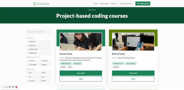
Key Solution #3 - Intuitive Course Marketplace
The course checkout section is vital to the website and company's success. I simplified the process by incorporating filters and a search navigation for each course, ensuring users don't feel overwhelmed and can easily find courses that suit their needs.
14
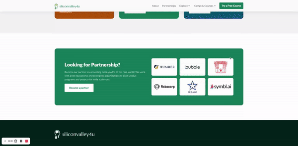
Key Solution #4 - Easy Partnership Access
The partnership program is crucial to SiliconValley4u's business model, offering graduates real projects that may lead to internships. Recognizing its importance, I enhanced the partner project process, making it more intuitive and integrated into the homepage.
15
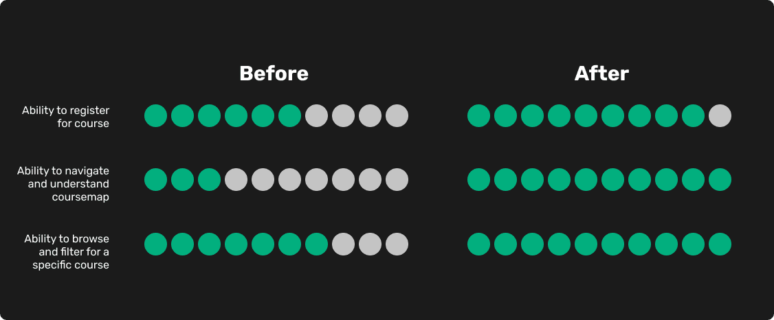
Guerrilla and Usability Testing
To assess the impact of the redesigned website on user experience, I conducted two rounds of user testing. I asked a random sample of 10 users from the target market to navigate both the original and redesigned websites. They were given three common tasks:
Register for a course
Navigate and understand the course map
Browse and filter for a specific course
16
Satisfying Clients is More Than Just Good Design
SiliconValley4u's redesign represents my best work yet. However, effective communication with clients is vital to align their vision with the final design. Learning to gather feedback continuously during the design process ensures timely implementation of features and meets deadlines, ultimately creating a satisfactory experience for clients.
17
Areas of improvement
Though fun I could have improved on the following aspects:
Could have gone more in depth with research beyond just testing for usability.
Website could have a more unique design with less of a templated feel to differentiate it from competition.
Home page could utilize better story telling on scroll to engage the user better.