Carbon Is Bad
CarbonIsBad is the world's first on-chain carbon emissions calculator where users can calculate their emissions and offset their carbon footprint.
Role:
Design Lead
Tools:
Figma, Notion, Figjam
Client:
CarbonLink
Date:
December 2022
01
Problem Statement
People are often unaware of their carbon emissions and the impact they have on the growing climate crisis.
02
Solution
Offering a service that allows individuals to both calculate and compensate for their carbon emissions on a single platform.
03
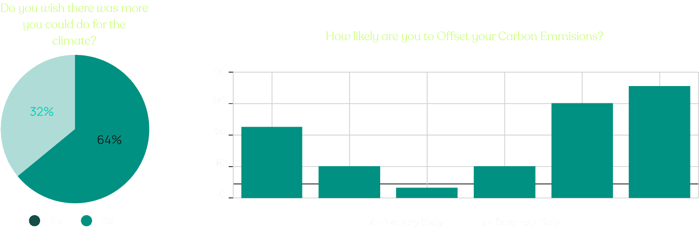
Market Data & Survey
We conducted a survey with a random sample of 100 people which yielded the following insights:
Gen Z and Millennials are more concerned about carbon offsets
People with higher disposable income were much more likely offset their carbon emissions
People with higher levels of education are more likely to offset their carbon emissions
04
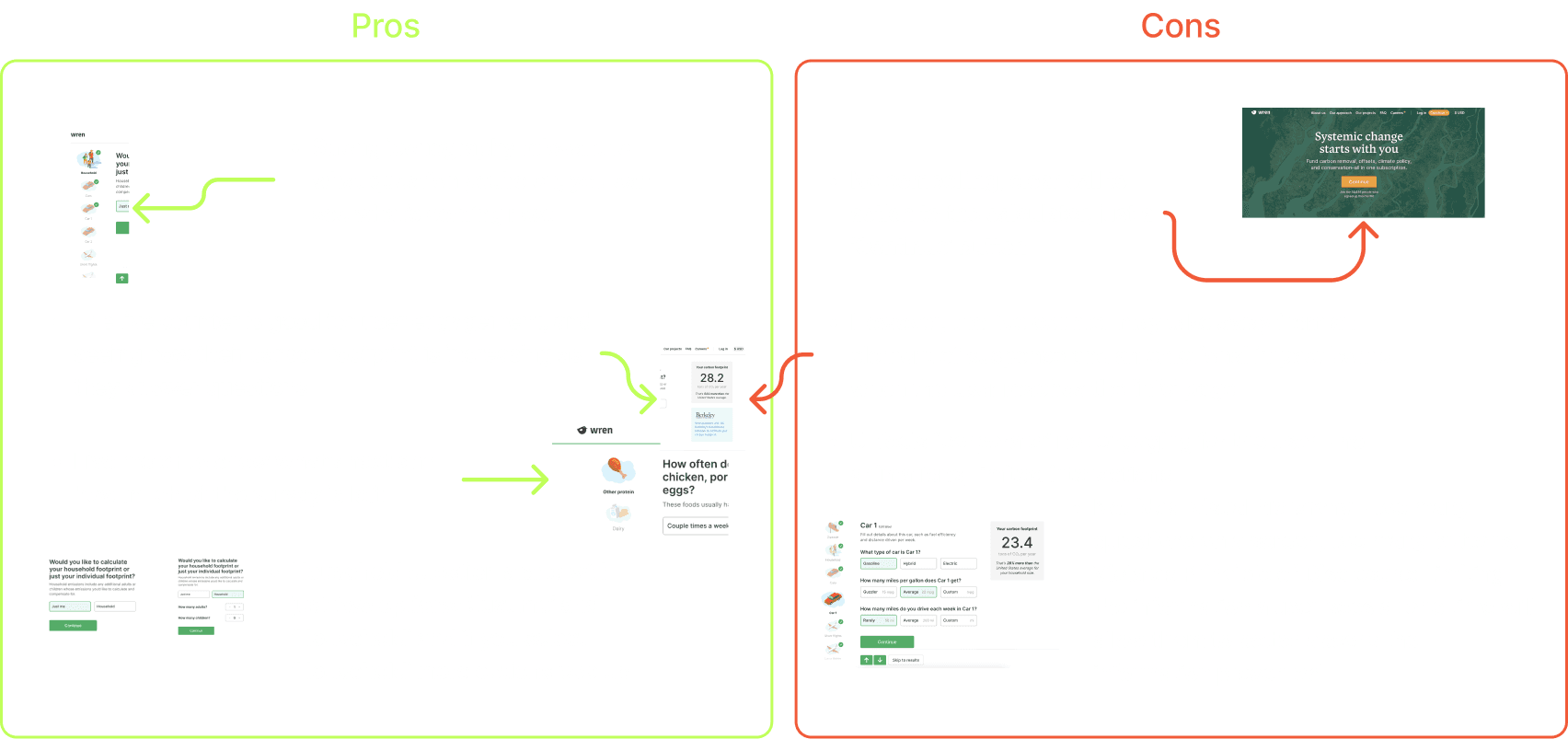
Competitive Analysis: Wren
Our team conducted a competitive analysis of our main competitor, Wren. What we found was:
Wren lacks a compelling clear call to action for their calculator
Wren's calculator lacks in visual hierarchy which confuses the user
Iconography and micro interactions instantly gratify the user resulting in a more engaging experience
Wren's brand feels very corporate which can have a negative connotation with climate
05
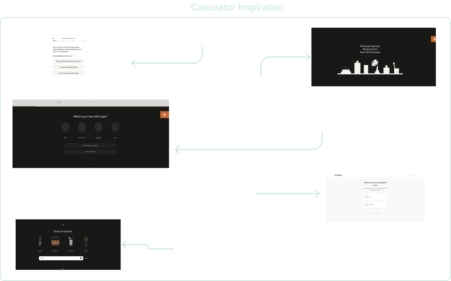
Inspiration from Similar Products
Drawing from survey inspiration:
Vibrant Visuals: Engaging, brand-aligned visuals combat monotony.
Clear Progress: An animated progress bar guides users effortlessly.
Creative Questions: Injecting fun and creativity enhances engagement.
06
Empathy Interviews
Interviews with 6 climate-conscious individuals explored their views, motivations, and actions in a supportive, non-judgmental setting to gain insights into their experiences and efforts.
07
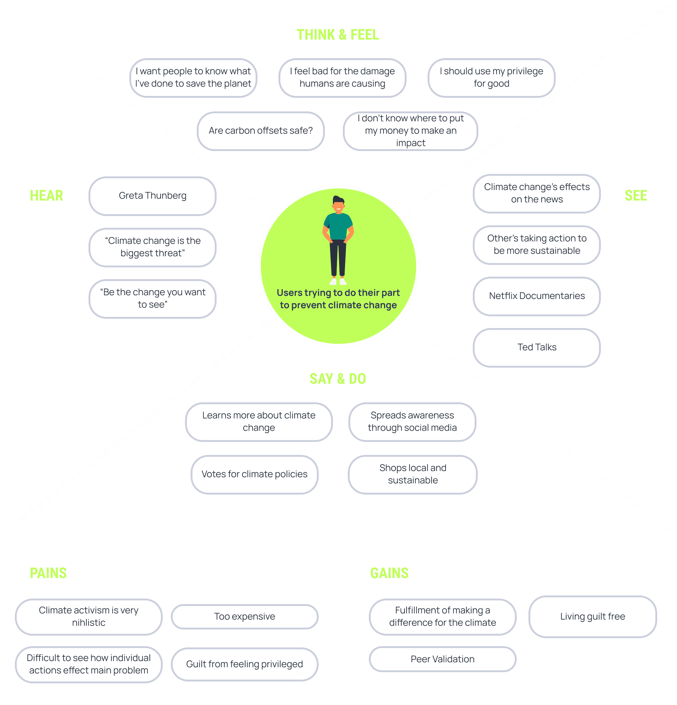
Understanding the User: Empathy Map
We used empathy maps based on interview data to understand user needs deeply, ensuring their wants and needs were prioritized throughout the design process.
08
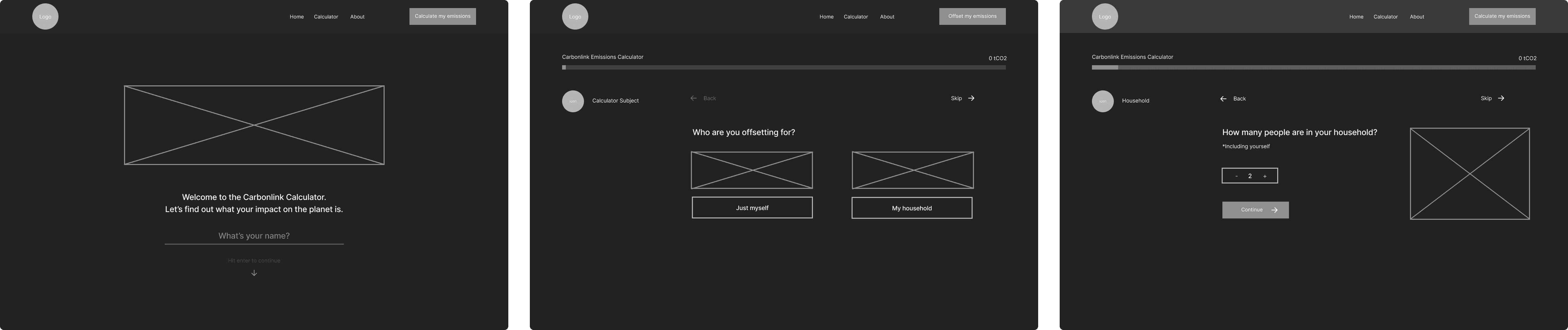
Lo-Fi
I created wireframes based on my sketches to prototype the product quickly and gather feedback for necessary changes.
09
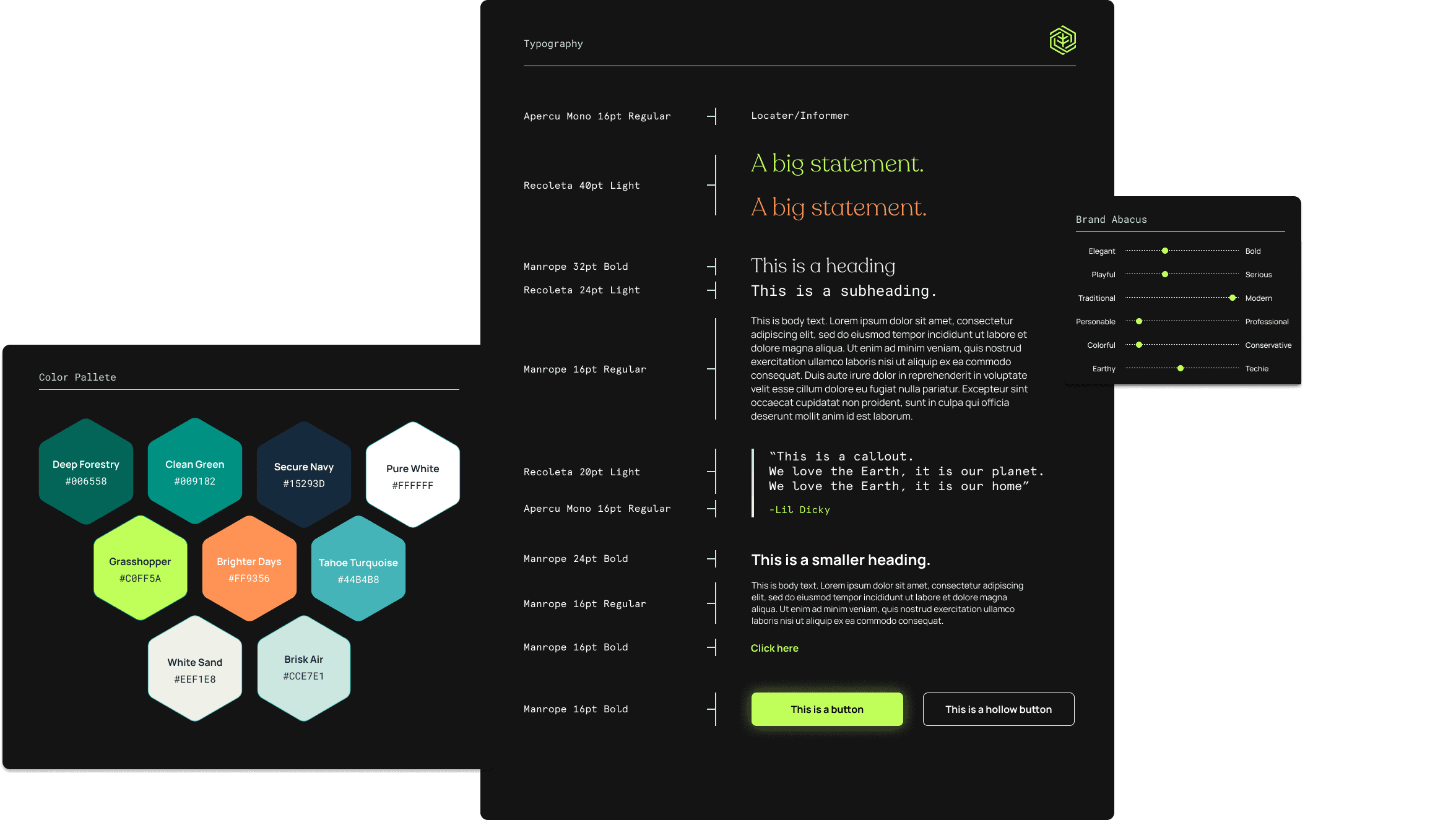
Color & Typography
The color pallet is inspired by the earth while still keeping things modern.
10
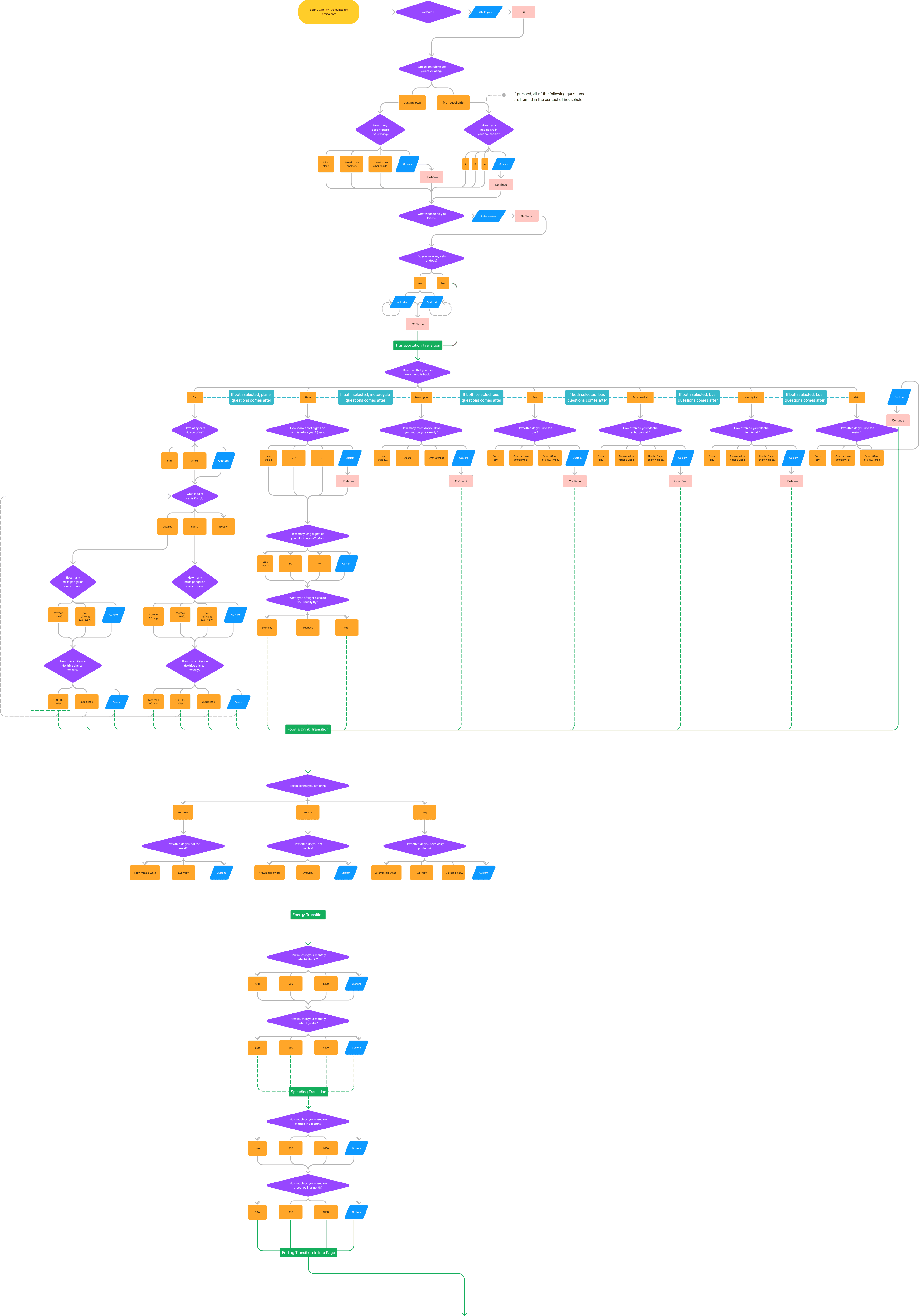
User Flow Chart
While designing all the proper screens for HI-Fidelity we consulted with our engineers on the order of questions from both a user and technical standpoint.
11
User Interview Testing - Meet Sabari!

Sabari is a 40 year old software engineer and an environmentalist based in Los Angeles.
She is very aware of the climate crisis
High level of disposable income
Masters level Education
I asked Sabari to give me her thoughts on the low-fi prototype and here is what she said:
"I love how in depth this calculator is. It is really making me understand what I can do to decrease my carbon footprint."
"This is great and all but I'm still a little confused on what an offset is and how it relates to the calculator."
"I understand how many tons of CO2 I'm emitting but I'm not sure what exactly that means for the environment."
12
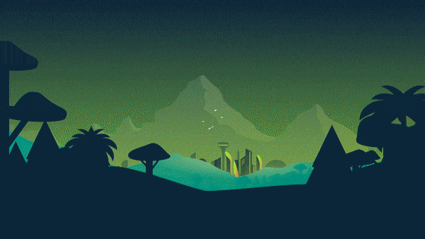
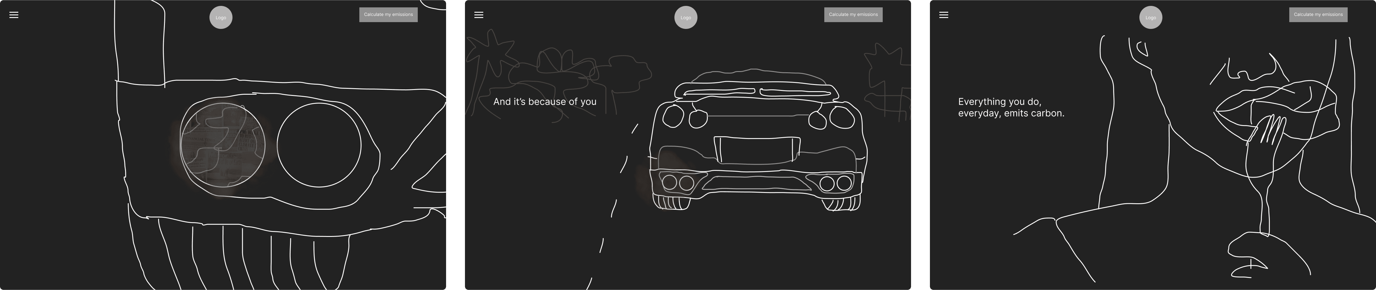
Key Solution #1: The Narrative
User testing showed product confusion. We fixed it when going back to lo-fi with an emotional, educational scroll experience explaining carbon offsets.
13
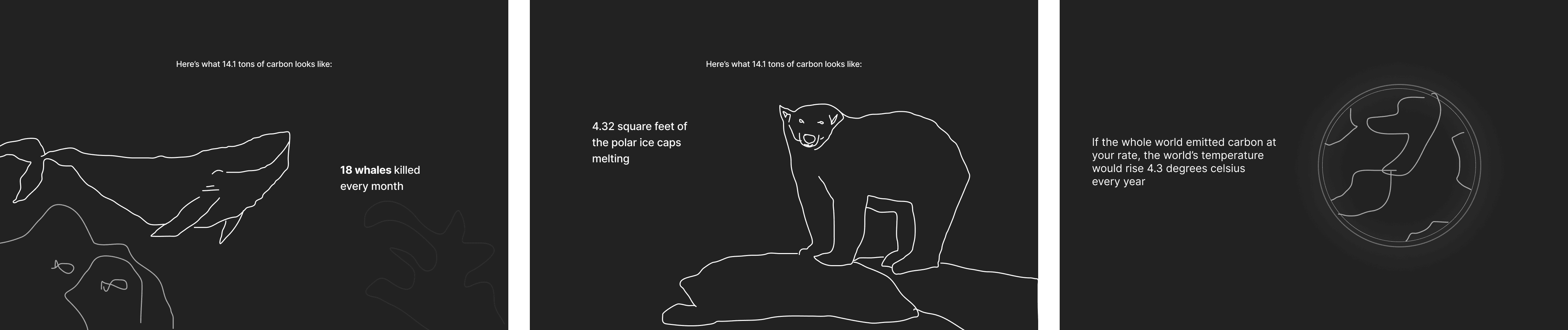
Key Solution #2: Contextualization
After the calculator experience users were having a hard time understanding what exactly the number of carbon tons they emit mean. After exploring solutions we decided to create a click through experience that contextualize how much carbon the user emits in a way that is easier to visualize
14
User Feedback - Welcome back Sabari!

“Using this now is really straightforward, I really like the narrative in the beginning! “
"I actually like how I know how much I emit with context I understand now"
15
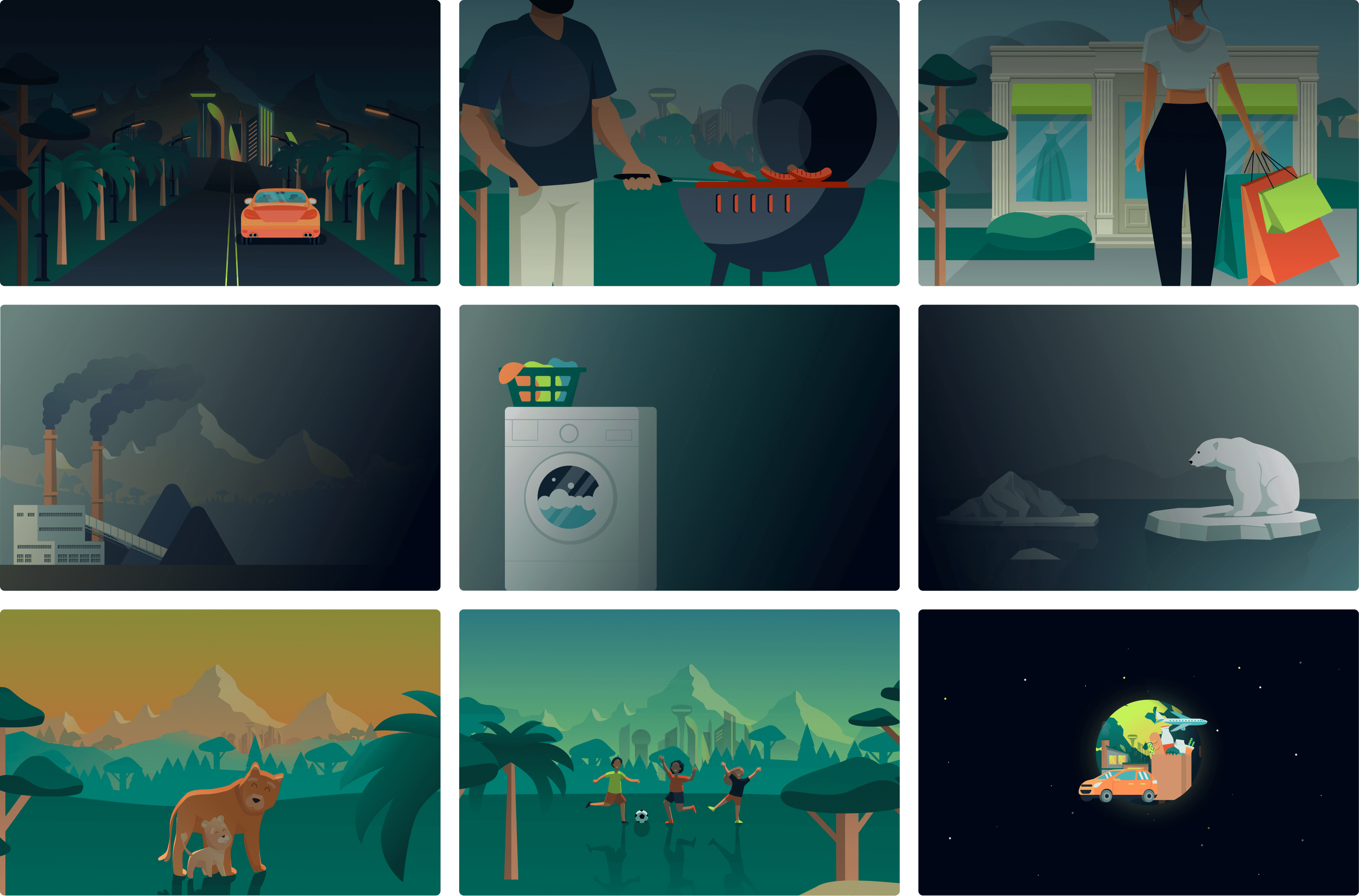
Branding and Graphic Design
After the lo-fidelity was approved I decided to move on to the process of designing in hi-fidelity. I designed graphics with Figma for the product that aligned with the branding and color scheme, resulting in a cohesive appearance throughout the product.
16
Design System
By implementing a design system, I was able to streamline my design workflow by working at a high-fidelity level and maintaining consistency in my design components, which made it easier for engineers to develop the product.
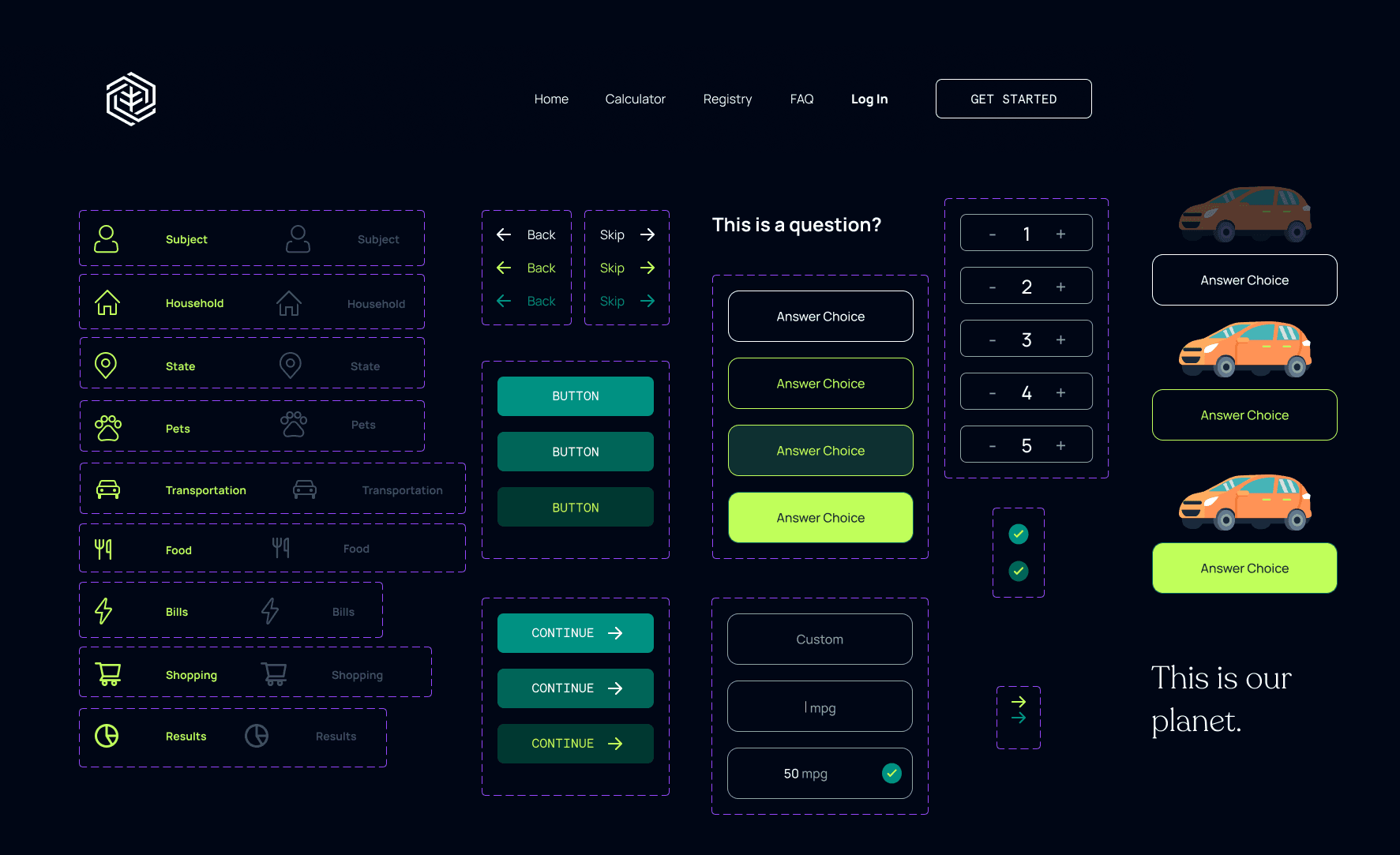
17
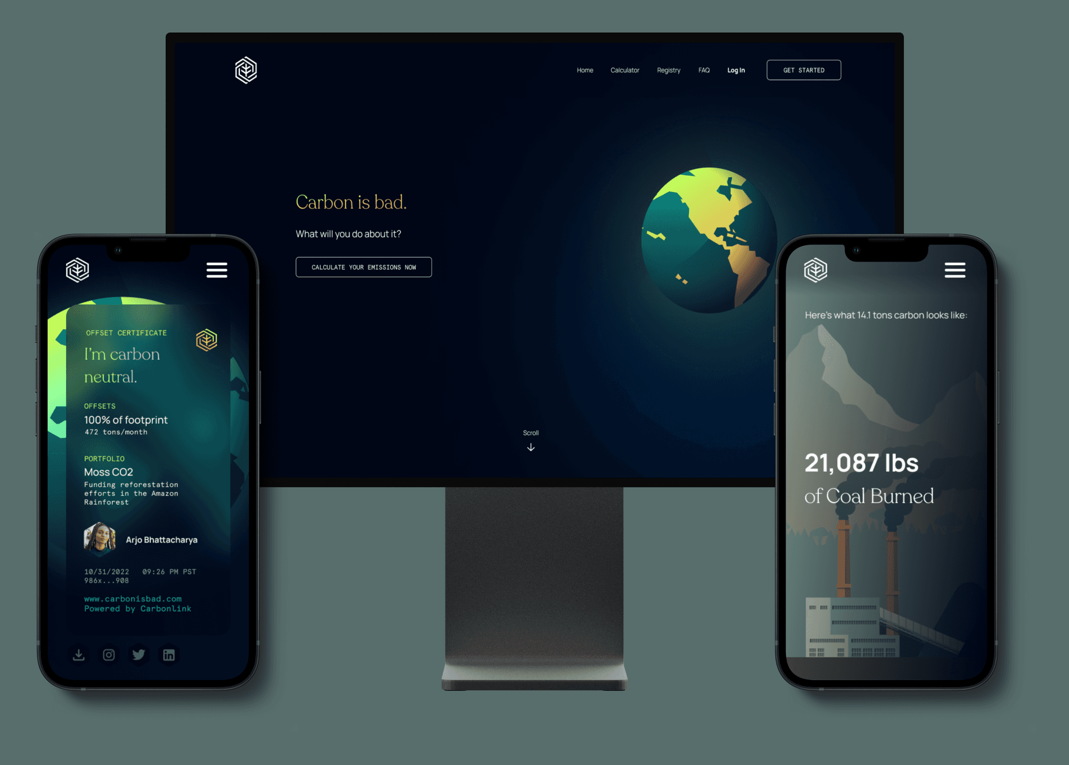
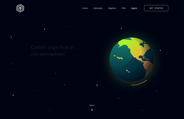
Learn about Offsets
We implemented an informative narrative that explains the concept of carbon offsets, with a prominent call to action that guides users to access the offset calculator.
18
Calculate Emissions
We added an informative narrative that explains the concept of carbon offsets, with a prominent call to action that guides users to access the offset calculator.

19
Underestand Offsets
To enhance the user experience of the calculator, we implemented a contextualization flow that enables users to visually comprehend the significance of their carbon emissions.

20
Successfully Reducing Carbon Emissions
Since CarbonIsBad launched, we've offset over 100+ tons of CO2, fueling a passionate movement for environmental change. With constant product iteration, we're primed to make an even greater impact.
21
Conclusion
What I designed was simply an MVP. As a long-term designer for CarbonIsBad, I will conduct user research and use iterative design to improve usability and user experience. I will also monitor market and user trends to keep the product relevant and make design decisions based on data. Some areas I could have improved upon are:
Better collaboration with engineers to ensure a smoother product launch with the narrative experience
More research could have been conducted with lo-fidelity prototype